Leaderboard
Popular Content
Showing content with the highest reputation on 04/09/2020 in all areas
-
From the album: Explore
The Hundred Islands National Park actually consist of 124 separate islands (123 at high tide). The islands offer countless opportunities at water activity. You can rent a motorboat and go island hopping, kayaking, diving or snorkeling.4 points -
3 points
-
3 points
-
3 points
-
2 points
-
2 points
-
From the album: Filipino Dishes
One of my favourite this dishes has coconut milk, squash and string beans. This is also a pilipino dishes.2 points -
1 point
-
From the album: Photography by Lois
From: https://english.visitkorea.or.kr/enu/ATR/SI_EN_3_1_1_1.jsp?cid=2643371 point -
From the album: Photography by Lois
Shot taken inside Casa de Manila, located in Intramuros Manila, Philippines.1 point -
From the album: Photography by Lois
A portrait shot of my friend when we went to Alabang.1 point -
From the album: Photography by Lois
A portrait shot of my friend when we visited a beach in Ilocos Norte.1 point -
1 point
-
1 point
-
From the album: Photography by Lois
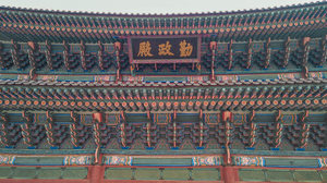
If you're watching Kingdom series on Netflix then you've probably seen this place. Since Gyeongbokgung Palace was the main royal palace of the Joseon dynasty and the Kingdom series was set on Joseon, they used this place for the filming. If you haven't watched Kingdom, I recommend it :)1 point -
1 point
-
1 point
-
1 point
-
1 point
-
From the album: Photography by Lois
One of the places inside the Gyeongbokgung Palace that is surrounded by water.1 point -
1 point
-
1 point
-
1 point
-
If you want a nice photos on your modelling portfolio, you need to hire a professional photographer or at least a person with a knowledge about camera and photography. You need a photos with different angles and shot. This are the shot that you need ( clean head shot, full length body shot, swimsuit shot, smiling shot, and strong closing shot ) you also need to include your body statistics on your portfolio. You need a hard copy of your portfolio so you can show it personally and easily view as well as a website or online portfolio so you can easily send it to email when they ask for it. You can visit my online portfolio : michellerolfe.portfoliobox.net and if you want to create your own online portfolio you can use this free online website: portfoliobox.net pictures below are example of my portfolio (hard copy)1 point
-
Painting Outdoors on a Full Pallet Field Day by Margaret Stanton An artist, inspired to paint the Gothic and Florentine architecture outdoors in Prague, must choose between an almost limitless range of subtle colors to use. In this medieval city, there are cooler hued buildings of stone with grayed lavenders, greens and blue browns. There are also warmer toned surfaces with ochre, yellows and oranges. Add to this an eclectic, no-rules range of color on many of the building's newly renovated surfaces, and you have a genuine, full palate field day! An artist needs to decide how to achieve color harmony in the shapes and nuances depicting these historic treasures if their next best painting is going to be a success. Rod Cameron reveals the secrets behind his choices of color in the painting titled, "St. Michelos Cathedral - Prague". Notice how he breaks down color into groups of "warm" and "cool". He tells students, "I saw the two towers in the sun as "warmer" mixtures: the thinner, taller steeple a mixture of cerulean blue and burnt sienna with white, and the main domed building a mixture of yellow ochre and burnt sienna with white." Using these warm hues as a reference point, Cameron uses a split complementary, which indicated blues, lavenders with touches of viridian green for the shadows and in the street buildings on either side. These cooler shadow colors frame the scene and provide exact compliments to the warm Hues of the Cathedral in the sunlight. To further enhance the warm atmosphere in the sunny part of this painting, the artist mixed cerulean blue into the sky. Cerulean blue, being the "warmer blue", supported the warm, sunny part of the composition and harmonized with the cerulean mixtures in the architecture. To see how easy it is to find and select complementary, split complementary and other color combinations, Rod Cameron suggests to artists to make or get a hold of a simple color wheel, found at any art supplier, and just dial up a color. In the case of Rod Cameron's painting of St. Michelos in Prague, he pointed to orange on the color wheel as his initial reference point, for the sunny surfaces of the Cathedral. The compliment of orange is ultramarine blue, but Cameron chooses the split complimentary; the colors that you find on either side of blue. The color wheel beautifully illustrates, lavenders on one side, and blues with a touch of viridian green on the other side; the split complimentary colors that Rod Cameron uses in the painting. Touches of your warm mixtures in your cool colors, and visa versa, will slightly gray things down, and go further to create great color harmony in your painting. The use of split complementary colors adds a greater range of color and more variety in your painting without sacrificing harmony. Color wheels are inexpensive and give the artist a better understanding of the color families and how they relate to each other. Even after you've memorized all the color combinations, it still fun to refer to now and then, plus, the wheel just looks cool hanging on the wall. Every studio should have one!1 point
-
This photo album is 100% recycle, made of carton boxes from public market and grocery. I painted it and put design to look like a camera. Aside from having photo album, you can also use it as your room decoration. Instead of putting those boxes in the trash bin, why dont you just try to create this amazing photo album. While doing things like this I enhanced my creativity and practice the three R (Reduce, Reuse, Recycle) Think green.1 point
-
1 point
-
1 point
-
OK, here's the tip: When you have learned a few words of the Thai language and you want to start trying them out on a Thai-speaking person, please don't get upset when they look at you all blank and they obviously haven't understood a word that you have said... Or, more likely, they are completely and utterly confused by what you actually did just say! You just need to work on those tones... For anyone literally just starting out with learning Thai - the sooner you can get your head around the fact that Thai, (like Mandarin and other Chinese languages,) is a tonal language - the better! The Thai language uses five different tones. Each syllable in any one word has one of the following tones: Lòw, mid, hígh, fȃlling and rǐsing Note the tone marks above. These are the most commonly used ones that you will come across when looking at Thai words that have been transliterated into the Roman alphabet - mostly in the 'Learn Thai in Five Minutes' type of textbooks. These tone marks are easy enough to produce in a Microsoft Word document but other than copying and pasting from Word, I haven't figured out how to insert them here on my own website! So I will use the following colour-coding to indicate the tones, for the purpose of this article: Low, mid, high, falling and rising This is based on a "traffic light" system. (The red is usually on top and the green is at the bottom of the three lights. Pink is "falling" from red - and light green is "rising from green - if that makes any sense?!!) Now you know why the Thai alphabet contains about three times as many letters as the Roman alphabet! In very simple terms, it is one of the ways that the different tones are indicated. The extended alphabet, in conjunction with some tone marks, (in some words but, by no means all) - and some rather complicated "tone rules" enables any Thai language script to be read phonetically, including the tones. The important thing to realize here is that if you transliterate any single syllable Thai word into the Roman alphabet, then that same group of letters can have up to five different and totally unrelated meanings when spoken back to a Thai person - depending on which tone you use... For words of more than one syllable, the problem does not go away! So it is best to: a) Take note of the tone marks, if you are reading a "Learn Thai in Five Minutes" type of text book. b) Whenever you learn a new word, make sure that you learn it together with the correct tone. Otherwise you could end up in an embarrassing situation! (More on this, later...) c) If you decide to make a list of new (transliterated into the roman alphabet) words - or better still, your own flashcards - you will need to indicate the tone, somehow. If you don't like the commonly used tone marks for transliterated Roman alphabet text, you can use your own colour-scheme or, for example, underline low-tone syllables, put a line above high-tone syllables - and a sweeping downwards curve for falling tones with an upward sweeping curve for rising tones. Just use whatever works for you. But indicate the tones and learn the correct tones together with the pronunciation of any new word that you come across. Here's why: Khun suay - all mid tones - ( คุณซวย ) - can be translated as: "You are unlucky, unfortunate - or even bad!" You probably meant to say: Khun suay - rising tone on the second syllable of the second word - ( คุณสวย ) - which means "You are beautiful!" Some more: Mai wai - falling then rising tone - ( ไม่ไหว ) - Unable to... cannot... Mai wai - rising then high tone - ( หมายไว้ ) - To expect, anticipate, predict Mai wai - falling then mid tone - ( ไม่วาย ) - Always, constantly, to keep on repeating or doing the same thing Enough said? So the different tones don't just change a word slightly - to mean something similar. There are absolutely no similarities in meaning between any of the above examples. They are completely different words and it's no wonder that a Thai person cannot understand you if you don't at least try to pay attention to the tones of each and every syllable that you speak. It sounds quite daunting but, really, it isn't - just as long as you learn the correct tones for each new word, every time you come across one. Your Thai friends will definitely help you with this... Pay attention!!!1 point
-
1 point
-
1 point
